Interior Design Secrets: How to Balance Colors
Introduction
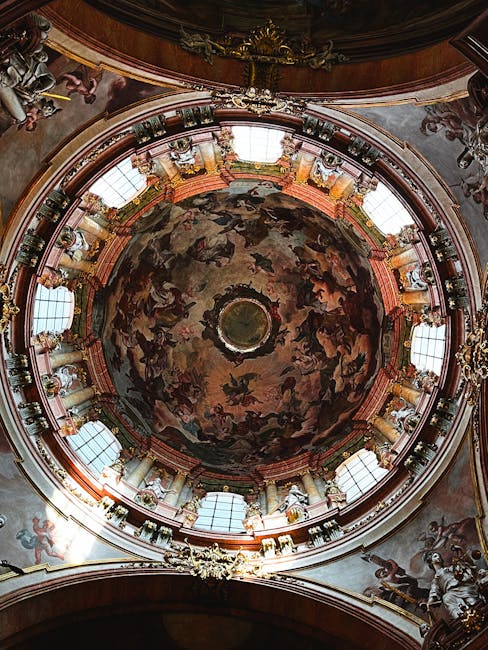
Creating a visually appealing and harmonious interior design hinges significantly on the art of balancing colors. It’s not just about picking your favorite shades; it’s about understanding how colors interact, influence mood, and define the overall ambiance of your space. This article unveils interior design secrets to help you master the art of color balancing and transform your home into a beautifully cohesive environment.
Understanding Color Theory for Interior Design
The Color Wheel: Your Foundation
The color wheel is the cornerstone of understanding color relationships. It visually represents primary, secondary, and tertiary colors, providing a roadmap for harmonious color schemes.
- Primary Colors: Red, yellow, and blue – the building blocks of all other colors.
- Secondary Colors: Green, orange, and violet – created by mixing two primary colors.
- Tertiary Colors: Combinations of a primary and a secondary color, such as red-violet or blue-green.
Color Harmonies: Creating Visual Balance
Utilizing different color harmonies ensures a balanced and pleasing aesthetic. Here are some popular approaches:
- Monochromatic: Using variations of a single color (e.g., different shades of blue). Creates a calming and sophisticated feel.
- Analogous: Selecting colors that are adjacent to each other on the color wheel (e.g., blue, blue-green, and green). Offers a harmonious and soothing effect.
- Complementary: Pairing colors opposite each other on the color wheel (e.g., red and green). Creates a bold and vibrant contrast.
- Triadic: Choosing three colors equally spaced on the color wheel (e.g., red, yellow, and blue). Provides a balanced and playful combination.
- Tetradic (Double Complementary): Using two pairs of complementary colors. Requires careful balancing to avoid overwhelming the space.
Achieving Balance Through Color Distribution
The 60-30-10 Rule: A Guiding Principle
A simple yet effective guideline is the 60-30-10 rule, which suggests allocating:
- 60% of the room to a dominant color (e.g., walls).
- 30% to a secondary color (e.g., furniture, rugs).
- 10% to an accent color (e.g., pillows, artwork).
This rule ensures a visual hierarchy and prevents any single color from overpowering the space.
Strategic Color Placement
Where you place color matters. Consider these factors:
- Light and Dark: Lighter colors make a space feel larger and brighter, while darker colors create a sense of intimacy and warmth.
- Vertical vs. Horizontal: Vertical applications of color can elongate a room, while horizontal applications can widen it.
- Focal Points: Use bolder or contrasting colors to draw attention to specific areas or features.
Neutral Backdrops: The Foundation of Versatility
Neutral colors (whites, grays, beiges) provide a versatile backdrop that allows other colors to shine. They create a sense of spaciousness and can be easily updated with changing accent colors.
Using Color to Influence Mood and Atmosphere
Understanding Color Psychology
Colors evoke different emotions and associations. Consider the psychological impact of each color when designing a space:
- Blue: Calming, peaceful, and trustworthy. Ideal for bedrooms and bathrooms.
- Green: Refreshing, natural, and harmonious. Suitable for living rooms and offices.
- Yellow: Optimistic, cheerful, and energetic. Best used in moderation, often in kitchens or dining areas.
- Red: Passionate, exciting, and stimulating. Can be overpowering if used excessively.
- Purple: Luxurious, creative, and sophisticated. Works well in bedrooms or accent pieces.
- Orange: Energetic, warm, and inviting. Good for social spaces like living rooms.
Creating a Cohesive Atmosphere
Consistent color palettes throughout your home create a sense of flow and harmony. While each room can have its unique color scheme, ensure there’s a connecting thread – a shared color or style – that ties everything together.
Practical Tips for Balancing Colors in Your Home
Start with Inspiration
Gather inspiration from magazines, websites, or even nature. Identify color palettes that resonate with you and use them as a starting point for your design.
Test Before You Commit
Always test paint colors in your space before committing to a full room. Observe how the colors look under different lighting conditions throughout the day.
Incorporate Texture and Pattern
Texture and pattern add depth and interest to a color scheme. Use textured fabrics, patterned rugs, or decorative accessories to break up large blocks of color.
Don’t Be Afraid to Experiment
The best way to learn about color balancing is to experiment and see what works for you. Don’t be afraid to try new combinations and break the rules – as long as the end result is visually pleasing and reflects your personal style.
Conclusion
Balancing colors in interior design is a skill that can be learned and refined over time. By understanding the fundamentals of color theory, utilizing the 60-30-10 rule, and considering the psychological impact of color, you can create spaces that are not only visually appealing but also emotionally resonant. Remember to start with inspiration, test your choices, and don’t be afraid to experiment. With a little practice, you can master the art of color balancing and transform your home into a haven of style and comfort.


Post Comment